- Maak gratis account | Log in
- Je bent niet ingelogd


Hier komen de laatste 3 forum topics
te staan waarop je hebt gereageerd.
te staan waarop je hebt gereageerd.


| Designing With Shadow +1+ |
Hey there guys and this is the first blog within my design blog series. Each week I'll pick one person from the comment area to give the next item to design. Each of these blogs will contain to begin with simple and basic shading and designs and as they move on after the basic shading, I'll be showing how to add extras such as glitter, sparkles, logos and all sorts. Also if there is a design of mine that you like, if you would like a shading break down of it, then feel free to message me.
This weeks item was picked by Criminal, who picked out a blouse that I edited slightly. Note: My shading isn't perfect. I'm only making these blogs to show others how I design. Sometimes my shading doesn't look right and I apologize for it, however if you get anything from my blogs, then it would be great if you could show me! Now let's begin! First thing first, if you want to design an item within real life, then get your references within the file/program that you are drawing in. For this design, Criminal picked out this shirt:
 When looking at this shirt, you pick out small bits of the design that you wish to keep. For this, I'm going to keep the different sleeve lengths and play around a bit with the open collar idea. Not too keen on the breast pockets so I'm going to remove them as well as change the colour to a more classic office white. When you've got an idea sorted out of what you want to design, then taking the colour red simple sketch out roughly the idea of the shirt. It doesn't matter at this stage how rough the lines are, we'll edit that once we have the sketch fully out. Here I'm showing you the sketch design as well as the more clean line-art. As you can see within the clean version, the lines look a lot better and keeping it at 1pxl is key to making it look nice and clean as well as professional. 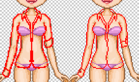 Right, that's our sketch and line-art done. Yes, it's done for the moment and we will return to it AFTER we've done everything else. The next step is simply picking what colour you want. Seems easy? It's not. When choosing the base colour you should NEVER pick a colour that's either too bright nor too dark. In the image below I've shown the areas to not go within unless you are planning on doing a black or a white design. If you go within these areas depending on your shade, it can make it rather hard to be able to shade or highlight. 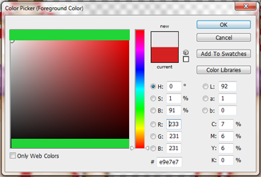 Now we start out colouring. As I said first, I'm going to be doing a bold move and doing white. I've designed a lot in white so if you wish to do the same, then gladly pick the colours off them. Same with black as well. Once you have your colour, just simply colour in your line-art. 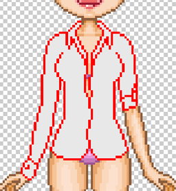 Now we have our base, we can really start to have some fun. Get the colour that you have and make it either one or two shades DARKER. This will be our first shading colour. One place that I personally find hard to shade is the stomach area, so I pre-warn you in advance that the shading on mine may not look right or look accurate. The breast area, the shading should come under the breasts and curve around the sides of them, depending on the material of the shirt you are making, depends on if you add any on the cleavage, however for this my shirt doesn't. 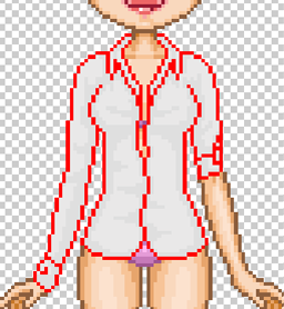 We're already half way, so if you've gotten this far without getting confused, then congratulations. The next step to this is to simply get your shade colour and then darken that again by two shades but so it blends it without being too in your face. When you have this colour then in the larger areas of where the shading is, just shade within them areas. Sometimes you can add shading within the thinner shading areas such as on the curves of the breast, but play with it and see what you can do. 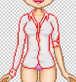 Nearly there guys! Back to our base colour and this time instead of darkening, we are highlighting. DON'T make it too bright so it stands off the design like a pink zebra in a grey hoard. You can the colour to be only just lighter then the base but light enough for you to see it. At this point, we want to fill in them blank areas however we don't want to take it too close to the shading. Make sure there is a gap and if the shading doesn't look right then it probably means it shouldn't be there. 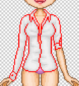 I think we're done no- wait we aren't? Ah yes, silly me for forgetting one important thing. The line-art. Yes that thing which is dead easy to do now at this point. Remember that darkest shade we used? Simple darken that and go over your read lines and we're sorted for now. If you want to add more details such as buttons, maybe changing the colour of the cuff, then go ahead. 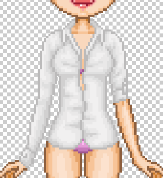 And that's it for now. If you found this useful then please use it, edit it, changing it and leave a comment below and you can pick the next item of what I'll be doing next week! Cya till then!  Shadow's Extras!
This will be a little corner where I may add extra tips, hints and even feature designs that I've spotted in the forums, so keep your eye out! Design Feature! Note: Designs are from the English server.  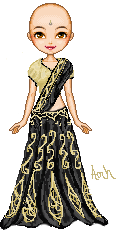 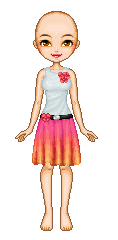 Grais | Amh | Vicingus Shading tip. My shading style tends to change, especially depending on the item. Sometimes the bold highlight and shading doesn't look right all the time, so here's a little tip for when it doesn't look right. Dotting. Yes that's right, dotting. I've done dotting a few times when I've designed and sometimes it just look a lot better. Here are three of my favorite examples of where I did this dotting: 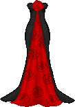 And it's dead simple to do as well. On the left we have just normal basic shading, thick, blond, no gaps. While when dotting we have a checker theme doing on and this can sometimes end up covering the whole design, and takes a lot longer to do. Taking a while to do? Yes, however the feel you get after putting in that last pixel is satisfying. So try it out!  |

 Anoniem


 0
0 0
0 0
0 0
0


 Speler blokkeren